hi Soumya,
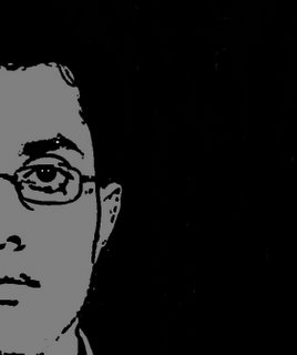
i'm just curious. DO u really sport a stern face like the one on ur display???????
;)
AquaM
 I didn't respond to it. The question had more than many grains of truth in there. The first impression that I leave on most people is of a grumpy snob. Atleast that is what they tell me once they know me better. I don't exactly know how true their initial observations were. But I definitely do look grumpy in many photographs. Including the one which had for long adorned my blogger profile (though digitally altered).
 I don't want the same to happen with my blog. My posts may most often be unimpressionable, but pictures they say speak a thousand words. Therefore I took some extra pains in choosing a livelier photograph (any other photo would be livelier). But none were lively (and unrecognisable) enough.
Next I attempted to caricature myself. But a friend felt that it didn't resemble me enough - and suggested that I use one of the characters that I had developed during my school-time cartooning mania. She believed that I have a striking resemblance with him. She might just be right. Hence the new profile photo.
I was also contemplating anonymity - under the nom de guerre - 'AlbinoBee.' But on the realisation of the fact that almost no one is even aware of my present existence (I'm anonymous in my own identity) and nor would anyone remotely come across the idea of sending a Rs. 20 crore legal notice. I have also added my email id (at the bottom of the page) just in case someone just wants to. This can alternatively be used to send love notes and hate mail which cannot otherwise be shared over blog comments.
Why does this new pic look like a cheap imitation of Fido Dido? :) Just kidding!
ReplyDeleteBut yes, the older pic did look a little serious. Though the change is so drastic, it'll take some time before we can forget the older you!!
For those who came in late, just remember - "Every man sees in his fellow blogheads, especially the H2O types, images of grotesque caricatures of himself." New concrete jungle saying.
ReplyDeleteHow is it that you are wearing a yellow T and not a red one?
ReplyDeleteon_the_walk, a small attempt to camouflage my real identity.
ReplyDeleteShivangi, I have heard that since I first proudly displayed it to my classmates in school. Everyone says so. But I remain adamant - it is and remains an original creation, uninspired by any brand ambassador (triangular head with features as uncomplicated as a snowman's and eight locks of scary, stand-up hair) of any soft drink. :p
Hello my Indian friend.;)
ReplyDeleteWhats going on in that far away land?
I'm freezing my azz off here in New Jersey.
hey saumya, ur last pic used to go so well with the way you write, no, its not grumpy :) but 'twas mature and thought provoking, this new pic is funny, it will take some time to get used to it!
ReplyDeletethe new pic is more like u, but i still prefer the old one. and ur 1st impression on me was not of a grumpy snob!!!!it was of a notice-me-now snob!!!! anyways, bye
ReplyDeletethe older pix gave a sense of seriousness missing in many blogs. the old pix symbolised your blog.
ReplyDeleteyour old pic suited the tone of your posts --- introspective and intellectual. but the new one's cool you'd be forced to start posting about parties and gel. hehe. just kiddin'.
ReplyDeleteShivangi, Gypsy, Dwaipayan, SHivam Vij, Abaniko, Should I start working on a new one?
ReplyDeleteheyyyyyy soumya!
ReplyDeleteso is this the new old u????? dats quite drastic I must say! and now I am not quite sure of who u really are!!!!!!!!!!
and yeah like abaniko sez, the old pic suited the tone of ur blog! this is quite a surprise...
:))))))))
AquaM
Old one please..
ReplyDeleteWe are much too familiar with The old now..
Hi Soumyadip, I agree with Anthony, AquaM, Abaniko, and Gypsy: Please bring back the old pic. It suited the content of your blog and had a certain snobbish flair! This one is so not you!
ReplyDeletePS: Pls don't post about parties and gel!!!
we want the old saumya back! j/kidding...lets c how u perform with this one, makeovers always have to prove themselves...:))
ReplyDeleteSoumyadip,
ReplyDeleteI also liked the old oic better. I thought that was you because (like Abaniko says) it suited the tone of your posts. the new one looks...well, unfamiliar!!
i second (or maybe third, and fourth it) - old pic was better..er..more human?
ReplyDelete